Project Overview

Acetra

Turning architectural dreams into sustainable construction reality

ACETRA is a successful international Structural Consult Engineering Studio, specializing in mass timber. Due to its rapid growth, the client was in need of a full rebranding and brand positioning, which we executed by reinventing a new name and ended with an overall visual identity and brand transformation.

Project Description
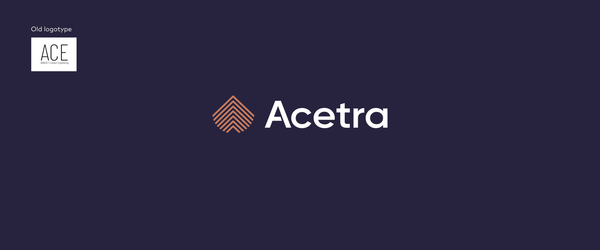
When a company becomes an international, fast-expanding rising star for its widely acknowledged and big, innovative solutions its brand needs to follow.  ACETRA, formerly known as Arheget Consulting Engineering, is one of the companies whose success called for a change in renaming,  brand strategy, visual identity, and overall new brand positioning.
 
The innovative solutions and expertise in mass timber construction quickly found their way to new markets and clients and put Acetra at the very top of the industry.  However, the formal name and visual identity have no longer reflected the established credibility and reputation they’ve rightfully earned and did not set a benchmark for the next decades and vision for the future – which is why they came to us.
Strategy

Renaming

We wanted to keep a connection with ACE  an informal acronym used for Arheget Consulting Engineering while searching for a name that is short, memorable, bold, and easily pronounced by any client no matter where they come from. The inspiration was found in Nordic languages. The reason number one, the region is leading in sustainable, carbon-neutral construction which is a culprit of the client’s vision. Reason number two, for that same reason, most of Acetra’s projects are located in the Nordic countries.

The lengthy process had a pretty straightforward solution. We merged ACE and TRA – inspired by the root of the word “wood or timber“ in most  Nordic languages. ACETRA was (re) born and loved, echoing the client’s vision.

Rebranding

Acetra Identity

The visual identity is an enduring, recognizable, and trustful visual identity that reshaped and reflected clients’ business prosperity. The new visual identity features a well-thought color palette reflecting the primary tool-timber.  Warm woody brown is combined with professional and trustful dark blue, defining the expertise and uncompromising endeavor to perfection.

Stylescopes
Rebranding

Brand elements

Strong and modern typography, with graphic intervention in the brand name for a more dynamic appearance, reflects an agile company, with a clear vision and determination to leave a mark in the industry and human society. 

To accent the new visual identity, we added a set of unique and recognizable symbols. The connection of construction, timber, and sustainable approach is united through the first company letter and a leaf-shaped construction.

The slogan – Constructing realities, followed to highlight a strong and credible beginning in the new markets and a new era of the business.